MUCHA CAFE: BRINGING VINTAGE DESIGN INTO THE MODERN ERA
SCHOOL PROJECT 2021
BRAND IDENTITY | PACKAGE DESIGN | ILLUSTRATION | TYPOGRAPHY
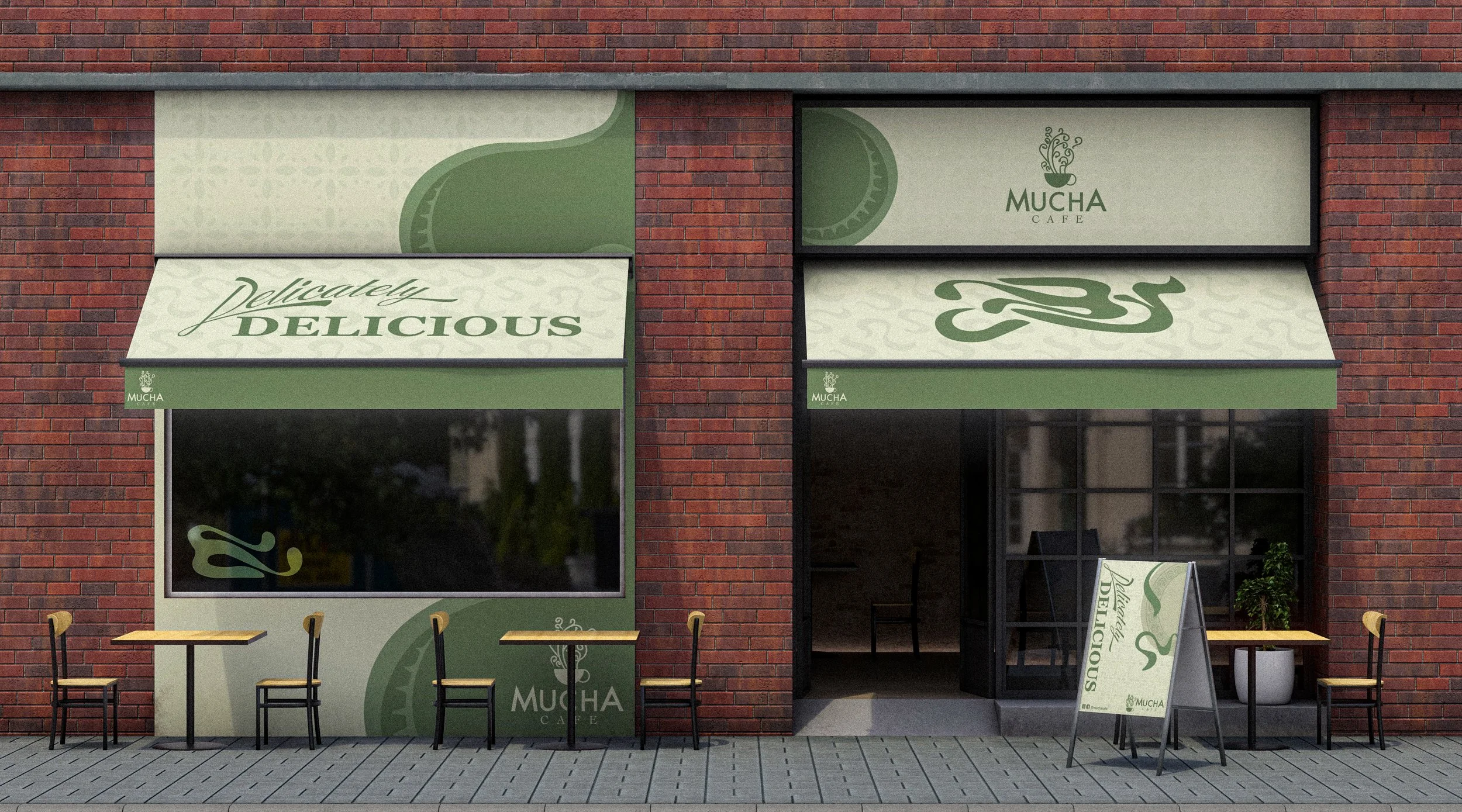
The Mucha Cafe is entirely a celebration to the father of Art Nouveau, Alphonse Mucha. Nature and movement are big themes within Art Nouveau. I think the style itself has a very warm, and elegant tone to it, and I wanted to capture that within the branding.
The biggest roadblock was bringing Mucha’s style into modern design elements that can make up a brand identity. This problem was solved by simplifying and taking key shapes from the Art Nouveau era, giving the brand a modern minimalistic but funky style.
BEGINNING SKETCHES & INSPIRATION
For the logo I wanted viewers to immediately relate it back to the Art Nouveau style, and cater to those that sought a modern twist to the vintage appeal. Even to people who aren’t familiar with the name and style will find a familiarity in the curving lines & bulbous endpoints, closely relating to a sprouting plant and the sprouting of new ideas, welcoming all free-thinkers.
Mucha has an intricacy to his work that comes off as delicate and rhythmic, through the slogan that theme carries into the food.
LOGO
INITIAL DESIGN IDEAS
Mucha’s work is inviting, with themes of nature, femininity and elegance. I began by looking through his posters, utilizing the colors and shapes within them to create patterns, icons, and a color palette that capture the same warmth as his art. The shapes were then simplified in attempt to bring a simplistic, modern style to the highly detailed work.
With the font choices, I wanted to match the elegant, funky shapes that are seen within the patterns and simplified shapes used to creative a cohesive branding style across all collateral. I went with Eckmann Psych as a primary font for this, and Calibri as a secondary font, as something more modern and readable. The colors were partly inspired by nature with some added warmth of old paper, matching the welcoming feelings of his artwork, while also having a vintage feeling to the branding.
MENU DESIGN
After figuring out the colors and design systems, I had enough to put together a menu. I utilized everything I gathered for an identity system, and used it within the menu’s layout. An icon tops each section of the trifold brochure, with warm and comforting greens. A sleek inside design gives easy readability while the outside background contains an organic Nouveau esque pattern for visual interst.
An icon tops each section of the menu brochure, with warm and comforting greens. A sleek inside design gives easy readability while the outside background contains an organic Nouveau esque pattern for visual interst.


