SONGBIRD MUSIC & ARTS FESTIVAL: SENIOR THESIS SHOW
SCHOOL PROJECT 2021
ENVIRONMENTAL DESIGN | BRAND IDENTITY | PRINT DESIGN
MOTION GRAPHICS | UI DESIGN | POSTER DESIGN
Songbird was a project that ended up being my senior thesis, and was born out of my love for music, along with the idea of the unification of people through a singular purpose, music.
This music festival project features elements that I learned throughout college, including logo design, typography, motion graphics, poster design and printmaking. The branding was inspired by the psychedelic 60’s art and counterculture movement, an era that some of my favorite bands come from.
Within the project, I created posters, merchandise, stage mockups and visualizers, an app and flowchart for the festival, instagram videos and printed items.
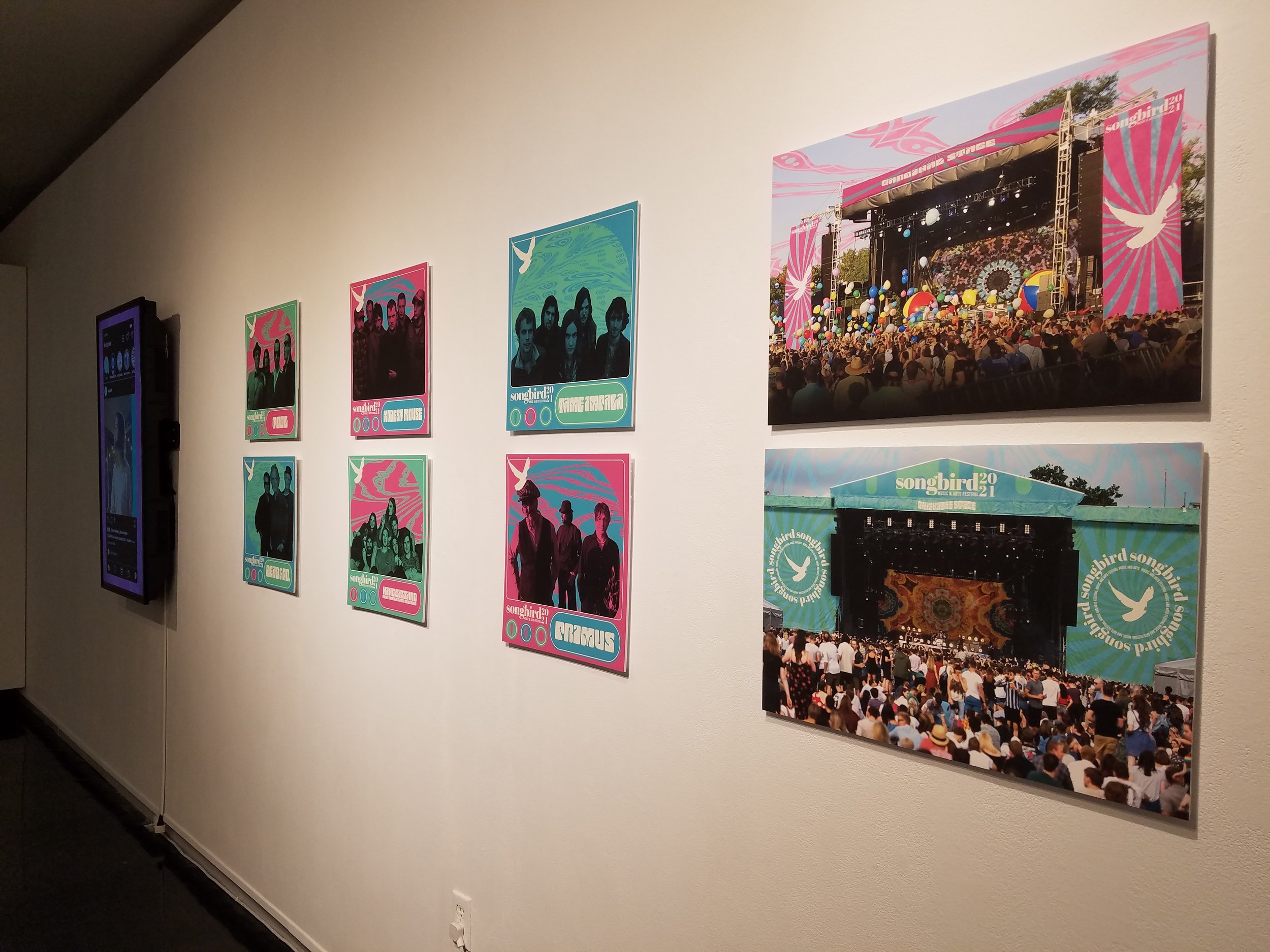
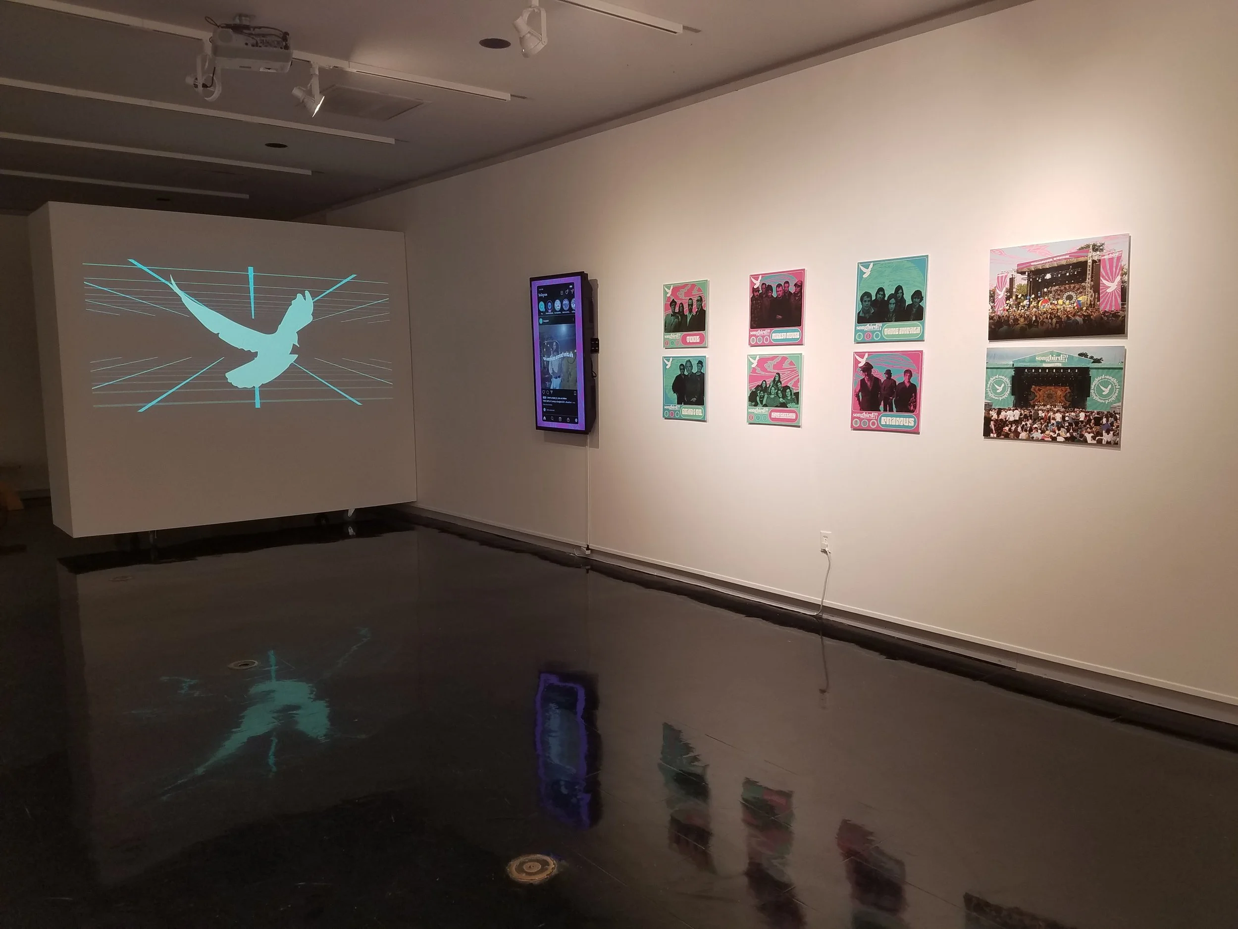
GALLERY SPACE


IDENTITY
For the identity, the inspiration directly comes from the the 60’s hippie counterculture movement. I wanted the branding to include mesmerizing patterns seen on old psychedelic posters. The goal was to make the identity feel lighthearted and fun, so I used bright contrasting colors and merged it with flat design to bring the identity into the modern era. The logo mark represents a dove, a symbol of peace and unification.
LOGO
MARK
I also included some icons all represented by Kentucky native songbirds, surrounded by a border that showcases a different instrument and bird on each day.
ICONS FOR DAY 1, 2 AND 3
The font choices needed to match the intensity of the colors, and using fonts that felt bold and funky were my go-to choices. Abril may have been made in the modern era, but the slab serif’s boldness gives it a retro feeling, as well as the Roller font, which was directly taken from 60’s poster illustrators such as Wes Wilson and Stanley Mouse. Amaranth was readable as a paragraph font, but also still has enough uniqueness to stand out among other sans-serif fonts.
COLLATERAL
For a music festival, there were lots of things to think about in terms of collateral. Using my screen printing background, I hand printed designs on tote bags and shirts tie-dyed by me to create some merchandise. Other collateral necessary for entry and things that people may find important for health and navigation were made as well, including tickets, VIP passes, wristbands, water bottles and a festival brochure.
POSTERS & LOBBY CARDS
I created 3 different types of promotional posters for the festival, each showcasing different parts of the event. I made a poster triptych for the days of the festival with the respective bands playing on each day. I then transferred the digital design files, and screen printed each poster. I also digitally printed some posters that showcased some people enjoying their time in the moment, bringing them to the forefront by highlighting them with colors and patterns used in the brand identity. Finally, I made lobby cards for each of the headlining bands, to showcase the types of music playing at the festival.


MOTION GRAPHICS
For the stage, I visioned there being a screen behind each band while they were playing that showcases trippy visuals coinciding with the festival’s branding. Using after effects, I created some animations that follow that vision. Since social media is a huge aspect of marketing now, I also made some digital advertisements that showcase the headlining bands with kinetic typography in sync with the songs playing.


